After taking pictures at Southwark station, I then travelled to Baker Street as I knew from previous experience that it is quite different in comparison. The Victorian station has a significant age gap between itself and Southwark, meaning the materials, structural design and lighting methods are dated. However, I was very keen to see just how old methods of architectural design were implemented, especially within the same city and not too far between stops from Southwark.
Here are the photographs are took of Baker Street, London:


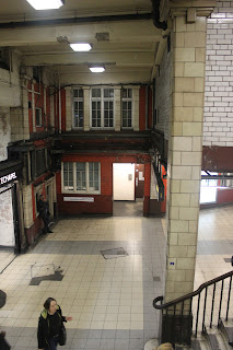


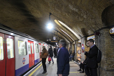


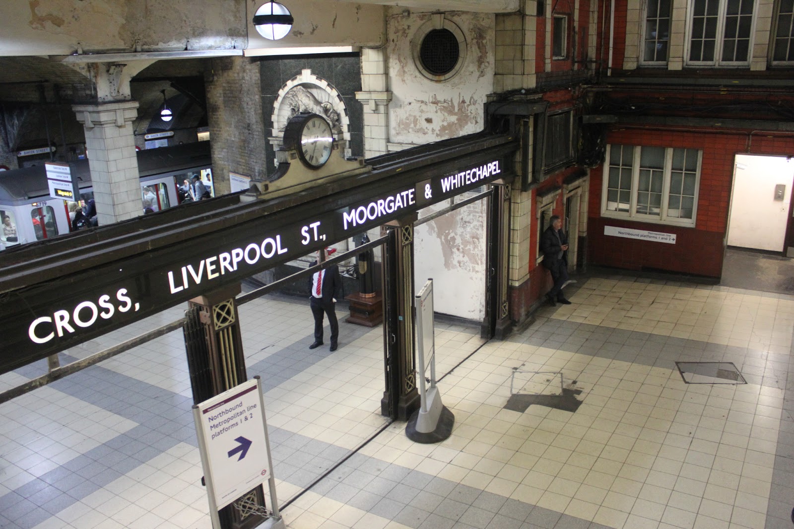
It was really nice to see the visual comparison between Southwark and Baker street during my research study. I chose Baker street as I knew it was a far less cramped station out of the surrounding stops in the area. I really admire how the design of the architecture is kept privately the same, with tall ceilings, brickwork and old wooden panels. Even some signs and light sources were kept in their original state, which accentuated the traditional, Victorian environment. It was also very interesting to see, that amongst the tones of brick wall,I noticed sections of bright red. This seems to be an earlier example of representing colour within a dull, urban environment. I believe it was used to convey the traditional 'Red' colour associated with the Underground which further conveys the iconic system. Also on many of the concave walls and pillars were many old crests and insignias. This station isn't just an old station, but a mini historical museum that showcases all different aspects of London. This particular area as well is often associated to Sherlock Holmes, for books and movies involving the station. This is visible represented in some of the tile work of the ticket vendor hall, where small silhouettes of Sherlock's profile is repeated. It is really pleasing to see just how much effort has gone into making this station, generating history no matter how much we evolve as people. Permanent reminders of a times we're forgetting as travellers, I think it's nice to take time and look a little deeper in these stations, as there truly is significant and beautiful details. Traditionally British and very much grounded to London, Baker street is a fine example of the cities success in the Underground Transport service. It is also visually satisfying to see how the use of bright spotlights add depth to the tunnels and outer walkway routes. Producing sharp contrasts between light and shadow, bringing out the material and texture of the inner infrastructure.
All photographs
uploaded to my blog are for research purposes only and are not intended
for sale or publishing. All rights belong to TTFL.
As part of my research, I decided to travel to London myself and take photographs of the Underground. First I had to purchase a student photography permit from the Film Office associated with media related to the Underground service. This cost me £50, but I believe a reasonable fee If I am to be professional adult. I didn't want to take any risks of photography on the Underground, so I adopted the proper procedure and I believe it is extremely relevant for my studies on this project. I decided to take photographs at two different locations, one at Southwark which is a quite modern representation and Baker Street, a much older, Victorian example. I chose these two different examples to see the comparison of lighting techniques as the transport system has grown. Not even the lighting methods, but also the architectural design and use of materials are also important to compare. It will give me greater perspective when I construct my own 3D environment, so analyzing these areas is vital.
Here are the photographs of Southwark Underground Station, London:


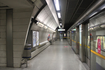


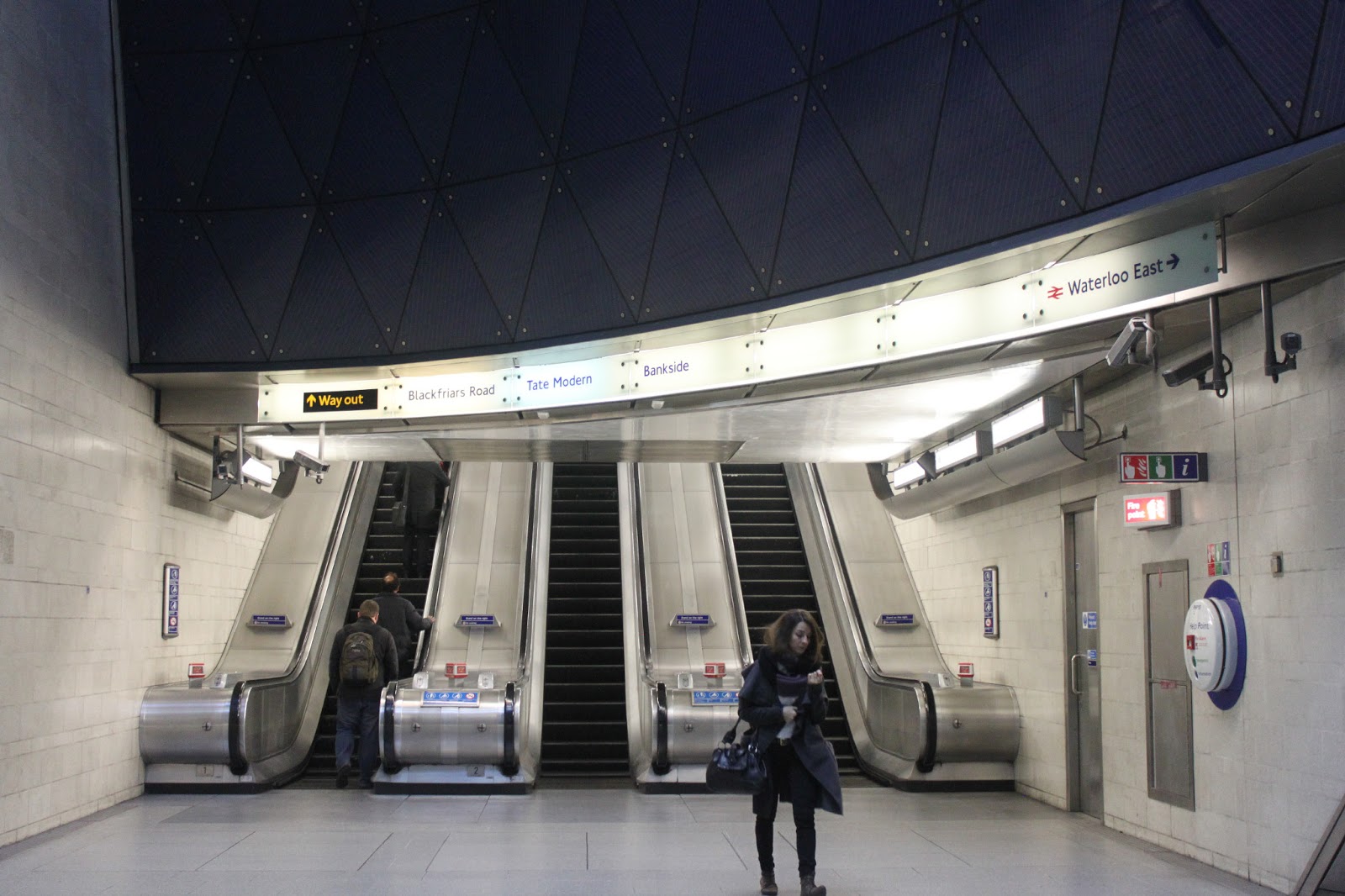
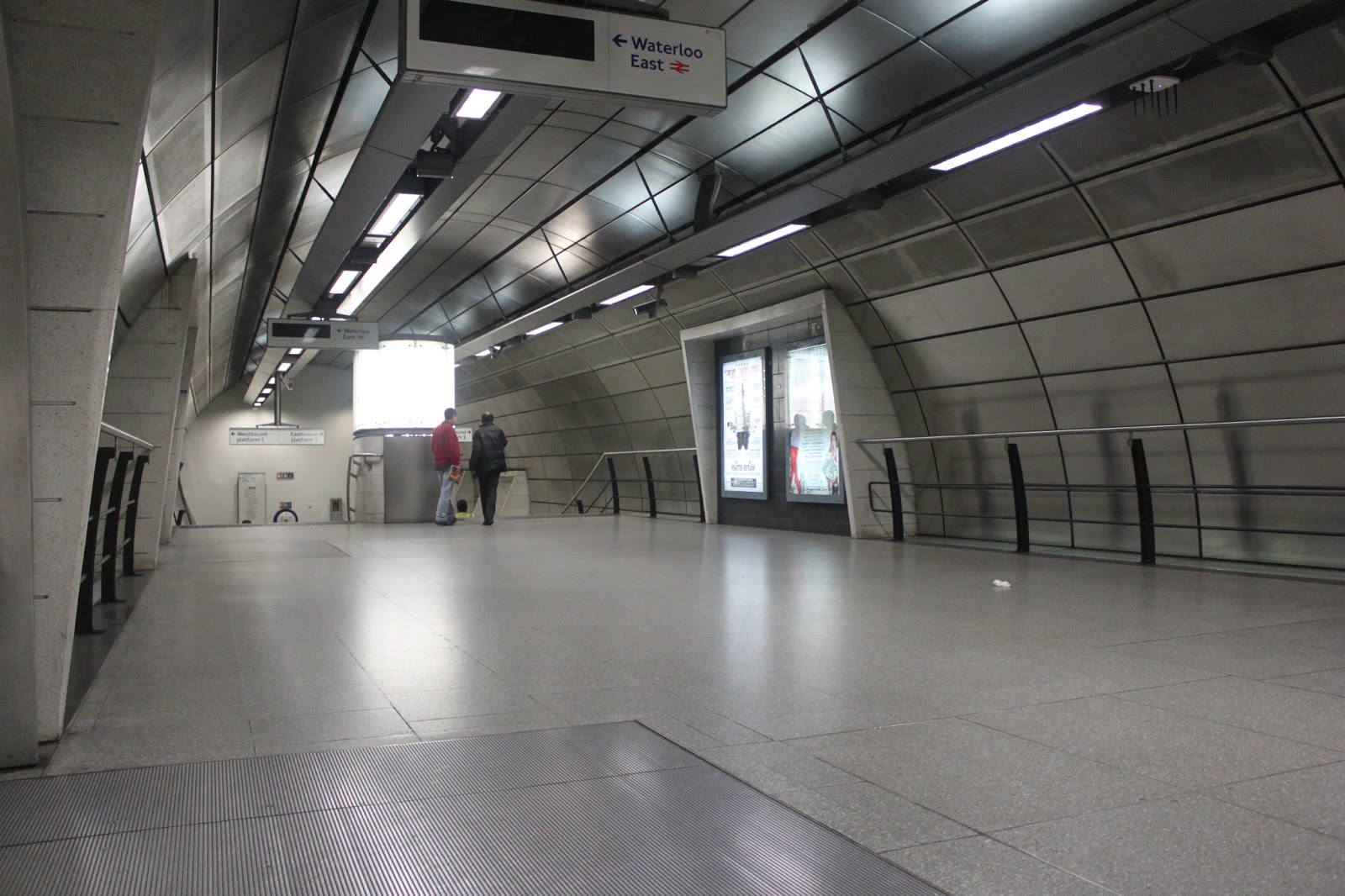
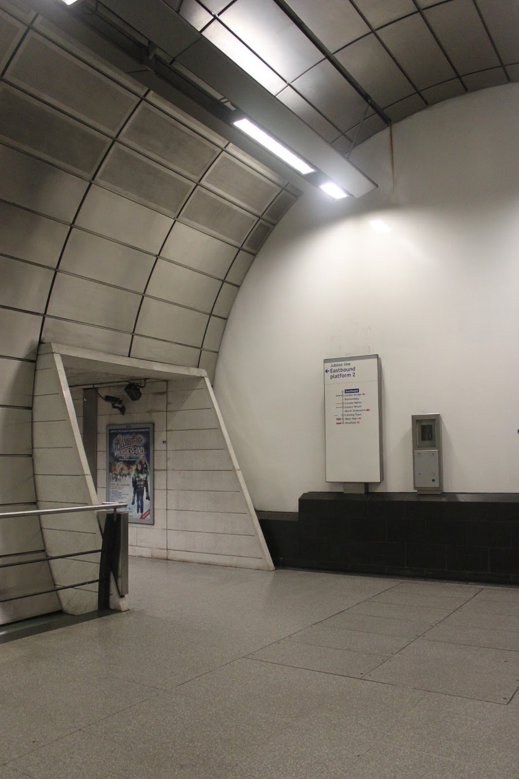
After taking photographs of Southwark, I really noticed from previous research how video games are beginning to represent the realistic methods of design in the architecture. Mirrors Edge came to mind as this particular station is quite modern and utilizes light with colour to generate mood. The overall station is made up of a variety of shiny materials, like metal and glass. It also uses the application of the colour blue, similar to how Mirrors Edge did within their Subway environment. I believe this is again due to adding atmosphere to a busy area, generating calm and tranquility. As you enter the main landing of the station, it is very spacious, beautifully coloured and represented, which actually makes you analyze your surroundings more so than other stations. The use of lighting in this station is adding depth and space to the area, using reflective materials to generate more areas of illumination. This produces a light an airy space for the traveler, which makes a nice change to other, far more cramped Underground spaces. Also the evolution of technology is evident with many aspects of Southwark station. Advertisements are illuminated on screens, instead of on paper posters and new glass barriers have been adding to the platform to reduce toxic air and increase safety. Southwark is a prime example of how the Underground tube service is evolving, by utilizing new technology and lighting methods to create a better atmosphere for the traveler. I really like the minimalistic application of colour within this station and intend to use that method for my own 3D build.
All photographs uploaded to my blog are for research purposes only and are not intended for sale or publishing. All rights belong to TTFL.