Sunday 6 January 2013

Texels and Efficiencies

In computer graphics, texture is represented by a combination of 'Texels', similar to how images are represented in Pixels. The texture is divided to a half way point between the center of each Texel and the center of every surrounding Texel for that texture. This is called 'Thresholding'. Each texel center will have a polygon surrounding it. This polygon area consists of all points that are closer to its Texel center than any other. This makes the texture application very efficient and also generates the same texture across a variety of other objects, without reproducing the same texture for each one.

It is important to understand Texels and texture efficiencies, especially when applying your own UV mapped information. For example, If I were to construct 3 tiled pillars, instead of applying 3 different sets of 'tiled' information, I can apply just one set of texture information and span it across the three pillars. This takes less information for the overall map to read and makes everything work much more efficiently.


Here is an image represented Texels, their centers or better know as 'centroids' and surrounding polygon:


Bibliography:

http://upload.wikimedia.org/wikipedia/commons/8/81/ProjectorFunc1.png

Friday 4 January 2013

Asset Model, UV Map Refresh and Texture: Maya

My my final productive study, I decided to UV map and texture my 'Bin' model from my previous rendered examples. It has been a while since I applied my own UV maps and textures to a model, as more recent projects, texture was not applied. I also found various methods of applying texture through presets on the Hypershade tool. I think it is important to refresh my knowledge, as when I come to make my own 3D environment I will need to add my own Photoshop work, such as texture and colour application. Advertisements and vendors will be areas specific for graphic design, so I need to refresh my understanding. Although I will be transferring this to UDK later  in my next project, It is still good for me to set an example of what I will plan to do.


Firstly I highlighted my Bin model and selected the 'Create UVs' tab in the toolbar. I then chose 'Planar' mapping as it would split the model in half, thus making it more efficient to texture. I also applied a Lambert material with a checker pattern, so I could see any potential texture issues. In irregularities in the checker pattern would indicate to a fault.


I then took a 'UV Snapshot' of my map and saved it as a 'Tiff' format. This will enable me to bring the map into Photoshop, apply textures/colours and then transfer them back into Maya later.


I then opened my Tiff file into Photoshop CS5


Using the magic wand tool I selected the map mesh and began applying colour and texture. I decide to choose these colours as I believe it would be nice to have a contrast within my illuminated space. I added scratched effects to areas of the Bin mesh. To develop the texture, I had to desaturate the above image, so when I import it into my bump map software, it can distinguish between white and black, which creates the depth of the texture. I saved my original colour file as Targa, so I could import the colour information to my model after I have textured it.


Here is my desaturated texture map put into a program called 'Crazy bump'. This software reads black and white information with a 'Height' map and produces textures based on the tonal information. I altered some detail intensities to the bump map and then saved it a s NRM (normals) file. This will be a format readable to Maya when I apply my texture.


Here is the 'NRM' file of my texture map. You can see how my applied details on Photoshop have transferred with the desaturated method. The darker details (scratches) will add depth to the material of the model.


To apply the texture I changed the material settings to 'Tangent Space Normals' this will apply the texture in the correct way. I also decided to change the material to a 'Blinn' as it will make the texture and surface of the bin shinier, which I think is more effective to not only show the illumination technique of the room but also accentuate the realistic aspect of the model itself.


Here is the Blinn texture applied with the 'Tangent Space Normals' tab selected.


I then loaded the Material Attributes tab by right clicking on the model. I then applied a 'Bump map' attribute and selected 'file'. From here I uploaded my NRM file generated from Crazy Bump and applied it to my design. The above image shows the texture applied and I am quite pleased with the result. The efficiency of the Planar mapping worked out well and didn't cause any texture issues when they were applied.


Here is the textured model in my illuminated space. I really like the effect of the material and texture with this lighting effect. It generates a good amount of reflected and bounced light, thus giving the scene more visual depth and realism.


To apply the colour to my model. I did a similar process to adding texture, however this time through Material Attributes, I selected the 'Colour' tab and chose to upload my Targa file. This overlaid my original Photoshop design before it was desaturated. It looks good and works well!


Here is the colour and texture combined in my scene. Although i like the contrast between both the model and the environment, I think the Blinn material reflected the colours with too much bright intensity. I believe adjusting the reflectiveness of the Blinn material could change this. However, I am still pleased with the end result.

I have really enjoyed my experiments with light in Maya. Although frustrated at not being able to use UDK at this time, I was pleased I could represent my intention in another fashion. Although I understand the process will be different in a new software, I think I can transfer what I have learnt in Maya. Understand how light science works in a 3D program is important as I am able to understand what types of light compliment each other and how they can generate a good illumination.

Lighting Asset in 3D Scene: Maya

I decided to further extend my study of lighting methods by producing another room with a more complex lighting method. When I eventually come to producing my own environment, I want to be able to make objects 'emit' light. Objects such as lamps, light bulbs and illuminated surfaces. Understand how to apply and alter light behaviors on object surfaces, will broaden the potential of my finalized environment. Therefore I believe this next conducted study will boost my skills in a productive way.

Here are the screenshots showing my step by step methods:


The two screenshots above are to show the 3 different types of light I have applied to the room. Similar to my previous exercise, I have two 'Area' lights and a ceiling 'Spotlight'. However this time, my spotlight source will be emitting from a physical object.


In this screenshot I selected my ceiling object and went into the 'Window' tab in the tool bar, selected 'Rendering Editors' and chose 'Hypershade'. Hypershade is a powerful and unique component that allows you to experiment with different textures and lights which can be transferred to your models. You are able to apply many elements and combinations to your models, generating exciting new looks and features.


In the 'Hypershade' window I began by selecting a 'Mia Material X' to my work area. This will be the material that will reflect my chosen light source and make it appear to 'glow' from the object.


I then added a 'Mia Surface Light' to my work space. This is the type of light that will be attached to the Mia material, producing a 'Spotlight' source.


I centered clicked and joined the Mia Surface light to the Mia Material. A small drop down menu appeared and I selected the 'Additional Colour' tab. This is what will bind the material and light together, which will actively produce the spotlight.


I then had to make some adjustments so that the new light would emit the right information. On the far right of the screen, I have adjusted Fg contributions and Reflective contributions to 4.000. This is adjust the intensity and reflective properties of the object. Thus making the light source appear to 'glow' Which is good when applying to the scene, as all light sources such as bulbs and lamps 'glow. I need this affect to be present.


I then dragged the new light source and applied it to my ceiling object.


I then went into the Render Settings tab and made some adjustments there to compliment the effect of the light source. I selected the 'Final Gathering' check box as this important selection makes all light accounted for with my environment, thus creating the 'illuminated' effect. I then altered my 'Point Density' selection to 1.500 and my 'Point Interpolation' to 50. This function will alter the intensity of the light and how it reacts within my environment space. The 'Accuracy' was also adjusted to 250, so that the light reacts in a more 'realistic' way, taking into account other objects in the space.


I then set the Render Settings to 'Mental Ray' and 'Production' quality. I also changed the resolution to 'HD 720p'. This will make my final render of my scene of a high quality, thus making the lighting effect more visually effective.


Like my previous lighting exercise, I added two Area lights to two opposite walls of my room. These will accentuate the power of my illuminated object and make the light reach further across the room. I made the intensity very low, just to subtly add more visual depth to the final render.


Here are my final renders of my test environment. I also constructed a basic 'Bin' model with a Blinn material, just to show the effects of the lighting surrounding it and how Mental Ray casts dynamic shadows and reflections. I am very pleased with the final outcome and really admire the simple, yet effective method of object illumination. I will be able to implement this method into many other light sources, with different intensities, colours and effects. Also the way in which the object actually glows really makes it appear to be an accurate source of light.


Here is another render screen from a different perspective.


In this image I decided to change the colour of my light source to a less intense 'Grey'. I actually really liked this effective, as it still made the ceiling spotlight appear to be the main source of illumination with the subtle 'glow'. However, the environment is darkened, making it appear less spacious and airy. I think this is a good understanding to take on board when it comes to producing my two variants of environment. Understanding the way in which light can portray atmosphere and emotion, is an important asset especially with my chosen project. I believe the change in settings shown above, effectively create different types of atmosphere.

3D Lighting Examples in Maya

I thought it would be a good idea to transfer some of my research into a visual piece. So I decided to model a small room and add a variety of differently scaled boxes. I then chose to illuminate the room and surrounding objects with different lights and methods to achieve a relatively realistic example. In doing this small exercise, I am able to experiment with different effects of light to generate a realistically accurate setting. In doing so will prepare me for future projects as I understand how light behaves in 3D software.

Here are the screenshots of my experiment:


This first screenshot shows a small detail which I acknowledged that will help me in future designs, especially when it comes to modeling my 3D environment. In the bottom drop down menu under 'Render Stats' there is a tick box highlighted 'Double Sided'. When unselected I am able to see through two walls of my surface, so any objects or tools in my environment can be easily seen and altered. This is good so I don't have to keep trying to physically 'enter' the environment, as I can see it through the walls from the outside. A small but important function in Maya for future works.


In this image I have 3 types of light. The first, which is my light source is located on the ceiling directly above the box objects. This light is a 'Spotlight' which will produce the most visible light. Firstly I added the Spotlight into my environment and adjusted the brightness intensity to quite low. I did this because I didn't want my scene to be too 'bright' as I wanted shadows to be equally as important. Glimpses of light on objects are sometimes all that is needed to create a real sense of 'depth' within environments. I learned this through 'Dan Kitchener' painting methods with his own environmental designs.


In this image I had to adjust the settings of the Spotlight so that the light itself had some sort of diffusion. In doing this will stop my light from appearing sharp and unrealistic. Diffusion will add a softness and fall off radius, which lights naturally like this do. I went onto the 'Channel box' menu and adjusted the Cone angle, Penumbra angle and drop off radius to generate that diffused effect. I changed the values a few times between renders so that I got the perfect visual look.


These next two screenshots show just how well adjusting these values work. A few small settings can make such a big difference when applying lighting to a scene. You can see in the above image, the unaltered Spotlight source. The light is very solid and sharp, bringing no depth or effect to the environment.


In the image above we can see just how different the Spotlight is when we change a few of those settings. The light has diffused, creating a soft edge and gradient, which also slightly  touches the edges of the objects in the room. This technique is already adding depth to the scene because we can already make out shapes of an image, even if slightly. The gradient of light doesn't stay in one solid shape, it blends outwards as light realistically does.


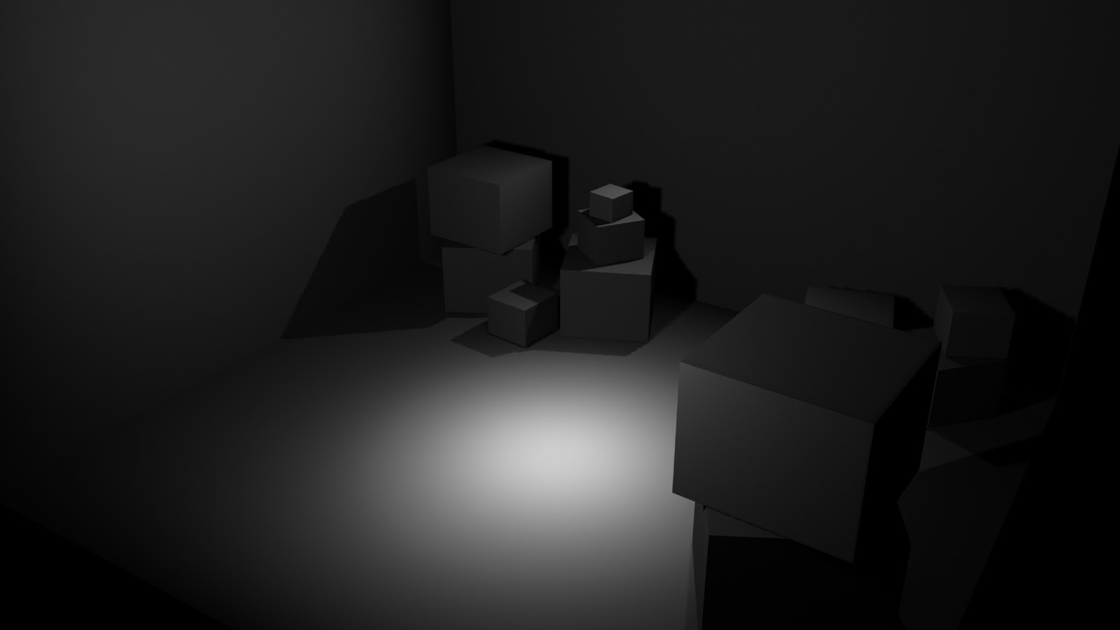
Although my spotlight effect works well, it is not enough to entirely illuminate my scene. I decided to add another two 'Area' lights to two opposite sides of the walls. I chose a very low intensity level so that the two new lights didn't overly brighten the scene. These two lights very subtly illuminate the space which when rendered, makes it appear that the spotlight is the one doing all the work. Even though there are 3 lights, it often takes more of them to produce the effect of one light source. Understanding the science and behavior of light, makes it easier to apply lighting techniques in 3D software, as you have a visual eye for the representation.


Here is a screenshot showing the render of my lighting techniques. You can see how the 3 lights have brought visual depth to the room, highlighting the box objects in a subtle way. The objects are illuminated in a gradient method thanks to the combination of lighting methods. The small boxes that are more central to the spotlight have a more intense brightness on the surfaces, whereas larger more distant boxes have less surface light, bringing them into the shadows. This method of lighting really does add depth to a scene. I am thoroughly pleased with how these turned out and plan to implement some of these lighting techniques to my own final production later on.


Here is another angle of my test room.

UDK: What and Why?


The Unreal Engine was first illustrated in 1998, featured in the renown FPS video game 'Unreal'. The Unreal engine is easily transferable to many platforms and game genres making it popular amongst designers. Since the first Unreal Engine in 1998, a further two more were built during the technological evolution of game engine power. The Unreal Engine 2 debuted in 2002 and The Unreal Engine 3 in 2011 thus representing finer graphics, animations and renders. In 2009, Unreal made their engine software free to the public, this is called the Unreal Development kit or better known as UDK. By making UDK available for all designers, enabled popular and indie artists alike to produce innovative new games. UDK make a profit share in any money earnings to thus keep the software free and accessible to all.

UDK is an incredibly powerful game engine, that has powered many games on formats such as the Xbox 360, Playstation 3, Wii U and iOS devices. Some well known games powered by the Unreal Engine are, Gears of War, Duke Nukem, Deus Ex, Bioshock, Splinter Cell and Borderlands.

Borderlands
Gears of War 3
Tom Clancy's Splinter Cell Conviction


I have decided to use UDK when lighting my 3D environment as I believe it is important to learn, especially being an aspiring game designer. I want to be able to export my Maya made models into UDK, texturing and UV efficiencies as well as rendering and lighting. For my project I was going to export an object into UDK and light it, but unfortunately I was unable to access a powerful PC computer during my extension and my Mac could not run the software. Instead I decided to continue to model an object, as well as texture to refresh my UV knowledge and light the item in a scene with new techniques. I will also reference the importance of UV efficiencies and texturing with understanding Texels.


Bibliography:

http://s3.amazonaws.com/gearboxsoftwarecom/images/_/9/af31920406bf84e594586ec496f28091f5dce7cf.jpg

http://blog.gamer20.com/wp-content/uploads/2011/09/Gear-of-Wars-3-1.jpg

http://assets.onehitpixel.com//2011/02/Splinter-Cell_04.jpg

http://gamedevwithoutacause.com/wp-content/uploads/2011/11/UDK_LOGO_blackglow.jpeg

Thursday 3 January 2013

My Vision

After compiling my research together, I decided to get some artistic work down as my mind is brimming with ideas. I figured it relevant to do some plans of what I want my 3D Subway environment to look like. Although my 2D digital painting skills are not as strong as my 3D work, I figured it relevant to play with colour and light a little bit to experiment with potential ideas. I have also decided to do a small focus on the particular items and assets within my environment, such as seating, vendors and rubbish bins. This will give me more insight when it comes to building my own 3D environment and also gives me a chance to get some relevant ideas down.


This is a very quick speed paint I did in Photoshop. I just wanted to play with perspective, structural design, colour and light. Although the image is roughly painted, I quite like the sense of depth it has with the structural shape. I also used hints of Red, as previously inspired by existing examples, I figured it relevant to complete the theme. I am quite pleased with how it turned out, as it gave my some insight to where I will be going with my environment design.

Positive Light

Negative Light

Here is my second speed painting, with a little more time considered. I have been reflecting on my research from both artist and video game examples. The vision of my environment feels a lot clearer after painting this picture and I feel confident in the application of colour as well as light placement. I have also begun to consider the types of lighting used. In the image you can see overhead spotlights which set a diffusion of the curvature of the ceiling. I have also made large areas of blue, ambient lighting that will illuminate the station with subtle cooling gradients. I strongly believe the application of blue is a good method for portraying a calm and positive environment. For my more negative environment I will wash out the colour of blue and focus more so on the application of shadows.

To represent my design thought process, I decided to draw up some blueprint designs of the environment plan and included assets. I have had some vision of what I have wanted my Subway station to look like for some time, so It was nice to draw up my idea. I especially enjoyed making blueprints for possible assets, such as seating, rubbish bins and vendors. It gives me a little more 3D visual planning, so when I come to potentially model this components, I have a good basis on where to begin.

Here are the blueprint designs for my environment, starting from the upper level, down:


Here are some asset blueprint designs, showcasing potential objects that will be included within my 3D environment:


Here are seating and rubbish bin examples. Displaying variants between modern and old. 


Here are some variants of vending machine, again old and modern designs. I prefer the modern design of vending machine here, as I believe I could play with the lighting methods in a modern way, more so than the classic example.

I think it is good to get some practical research done, as I am able to express my ideas and plans more visually. Although I understand this is a research project, I believe examples above show what I have learned and what I intend to do based on my study. I have already got many plans and details I want to include in my 3D Environment. I have also conducted a study in 3D of lighting technique, modeling an asset and refresh my knowledge of UV mapping and texel efficiency.


Dan Kitchener: An Artist Underground

During my research I stumbled across an artist named Dan Kitchener who caught my eye immediately. He specializes in canvas paintings and graffiti work within central London. What really grabbed my attention was his occurring pieces of the London Underground rail network and just how beautifully he painted them. His pieces represent such visual depth and outstanding lighting techniques, that I was so compelled by them, I had to get in contact to ask him some of my burning questions. I want to know what it was that inspired him to paint the Underground so much and how he went about producing light within his work. Most of his paintings involving the Tube network are primarily black and white pieces, with very subtle uses of colour to highlight small details of interest. The in which he projects a light source and accentuates the surrounding architectural design really inspired me, I just had to hear his thoughts behind his ideas. His representation of light also is extremely compelling and visually realistic to the eye. There are sources of light, which reflect off surrounding structures and materials, generating a mixed gradient of light, with different intensities and densities. This brings so much depth to his work that sets a dynamic atmosphere and sense of mood.


 Here are some of his paintings:


Here is a screenshot of the email I sent and my reply:


After reading through Dan's email, I was very inspired at his personal perspective of the London Underground. How it is an environment that never rests and is never still. It isn't a destination, it is always part of a journey and overlooked by most people who use it. It is interesting to see how Dan looks upon the Underground as 'a space between worlds' and he visualizes that space in his paintings. Being a resident in London, he too is exposed to the suburban transport on a regular basis, but is more fascinated by the environment than to ignore it, similar to how I looked upon it in my recent research. 

When it comes to lighting his environments, he uses a big source of light and let's the science do the rest. The intensity of main light source reaches all aspects of his paintings without brightly illuminating the piece. He uses purposefully strong contrasts between light and shadow to create atmospheric depth in his work. I liked how he mentioned in the email that not everything needs to be lit within a scene, just to let a larger light touch the edges of details or textures, allowing the human mind to make up the rest of the piece. It is with that  I believe his paintings look so stunningly atmospheric, because he knows he doesn't need a lot of light to bring out the smallest of details. The strong use of light and dark is truly innovative and easily the most inspiring pieces of work I have seen in a long time. I feel extremely fortunate to have located Dan and get to talk to him about his approach to lighting and also how he personally feels about an underground transport environment. I will most certainly take on board what he said in the email and transfer that knowledge in my own way.


Bibliography:

http://dankitchener.bigcartel.com/

http://www.dankitchener.co.uk/